

The Opportunity
The Disney Stickers team had the opportunity to be one of the first to create content for the new iOS app store iMessages feature. This new Disney Stickers brand needed a unique identity that could stand on it’s own as well as successfully combine various Disney IPs, each with it’s own set of unique brand styles guidelines.
The Solution
With Disney Stickers, our goal was to package up the amazing experience… a whole new way to add an array of Disney magic to everyday communication. We would create a brand identity system for the parent brand and sub brands and ensure brand cohesion.

Role
Lead brand designer on the Brand Marketing team at Disney Consumer Products and Interactive Media.
Discovery
Brand positioning
No other sticker brand possessed the breadth and depth of storytelling that is embedded in every Disney sticker. Apple users would get excited to add rich Disney IP to their everyday chat—these dynamic stickers would provide creative ways to customize iMessages and bring chat to life.
Brand Attributes
To position Disney Stickers as a “must-have” above all the other sticker packs, in the over-arching brand we would highlight the very recognizable (very loved) Disney magic. For individual IP sticker packs, we would honour and showcase the unique attributes of those brands.
We would tie this brand together through:
Graphic elements
Language
Motion
Target Audience


Millennials (1981-1997)
GEN X (1961-1981)
Baby Boomers (1946-1964)
Inspiration

Brand exploration

Brand family

Logo Concepts
Key Considerations
Content forward—must not compete with art
Art style agnostic—must align with all IP art styles
Concept 1
Peel


Concept 2
Sticker sheet


Concept 3
chat dots
(CHOSEN DIRECTION)


Final logo
The Disney Stickers logo was inspired by the idea that with Disney and Pixar Stickers, you can craft and create magical messages and bring your chat to life in a whole new way.

Animated logo


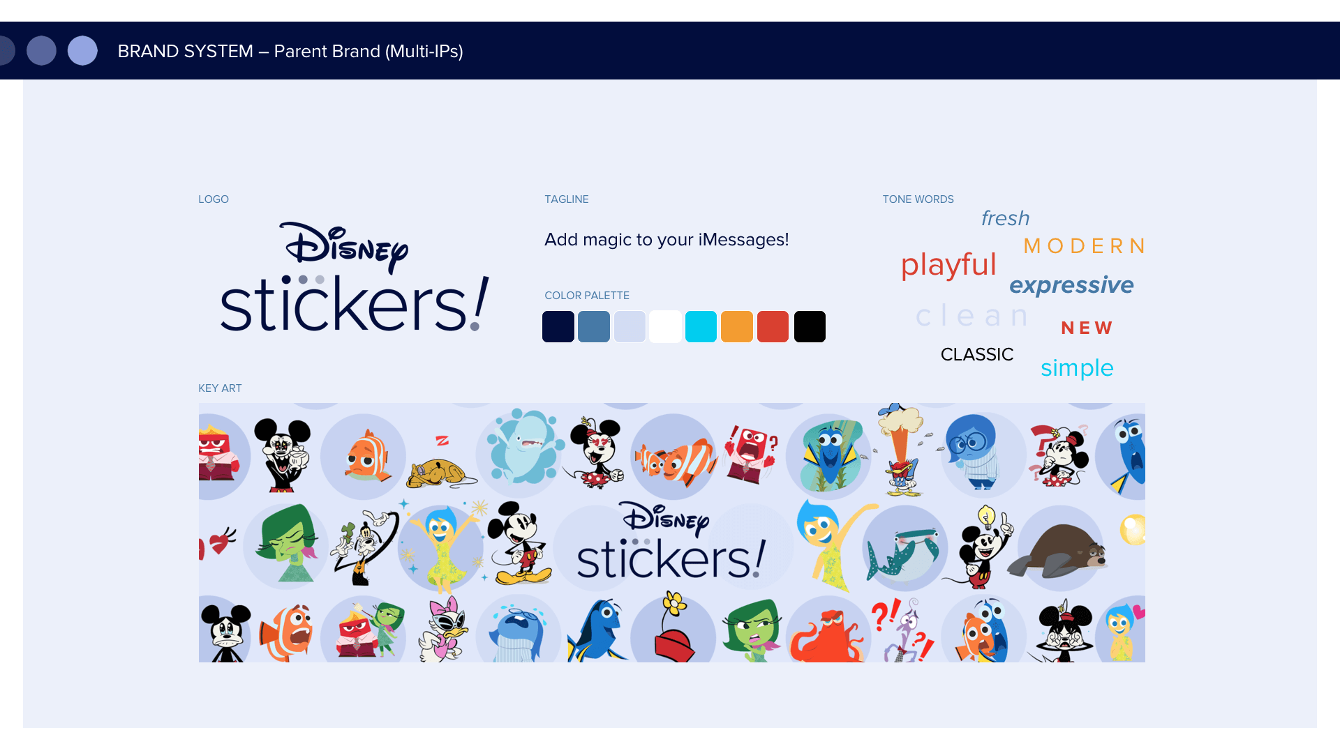
Brand System
A brand is more than a logo
A logo cannot tell the entire brand story and communicate its values in a single mark. Logos should be simple and clear memory hooks. A logo is part of an identity system.
Our identity system included colour, slogans, and emblems, rich, original content and a robust brand toolkit to extend our story & engage audiences.
Parent brand tile
Showcases multi-IPs.
Chat dots rationale
“Chat dots” are a recurring motif throughout the Disney Stickers branding system, and represent the creation and crafting of a message. They provide a container to visually separate each IP, which is a strict requirement for each Disney and Disney Pixar brand.

Sub Brand tiles
Showcases individual IPs.
Colour rationale:
We strategically chose our colour palette based on the following goals:
Must work as a cohesive colour system
Must work as individual icons
Must pop in the busy App Store
Colours should reflect brand essence per IP


Brand extension
Motion graphics / end screen

Trailer

Results
Disney Stickers was featured in one of Apple’s presentations
Disney stickers are among the most popular stickers in the App Store
Lessons
Disney Stickers showed us the value of simplifying individual brands down to a few key graphics and sentiments—to work well with other brands. We also learned the new submission process and specification templates for the new iOS stickers feature in the app store.
Content shown © Disney.